Navigation
Broadly speaking, anything telling users where they are, where to go and how to get there can be called navigation. When using navigation or customizing navigational structures, please pay attention to following common pitfalls:
Provide visual and contextual cues as many as possible, to prevent users from getting lost
Maintain consistency between form and behavior, or reduce the number of items in navigation, to decrease user's learning cost
Minimize page transitions (i.e. reduce the number of page tranistions required by a task from several to just once or twice), to ensure that user travels only a short distance from any page to another
Menu#
Navigation menu is an effective and user-friendly way for reprensenting site structure to users. A proper form of navigation should be utilized, once the information architecture of your site becomes clear and stable.
Top Navigation#
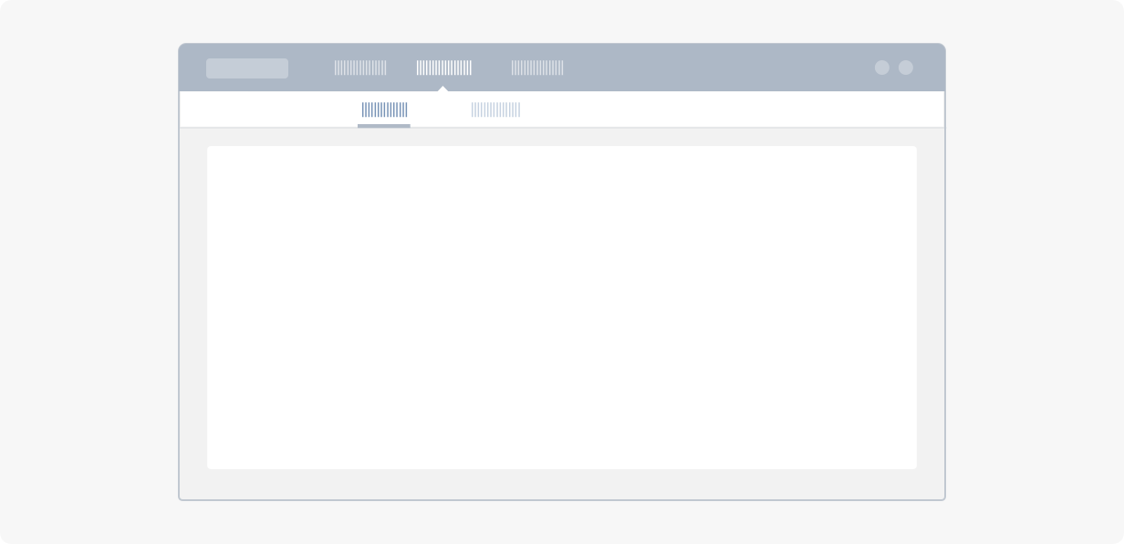
Top navigation menu put hyperlinks in a row and present information in a simple and straightforward way. It is suitable for landing pages and consumer facing web apps. The number of first level menu items should be between 2 and 7. Title for each menu item should contain less than 15 characters.
Side Navigation#
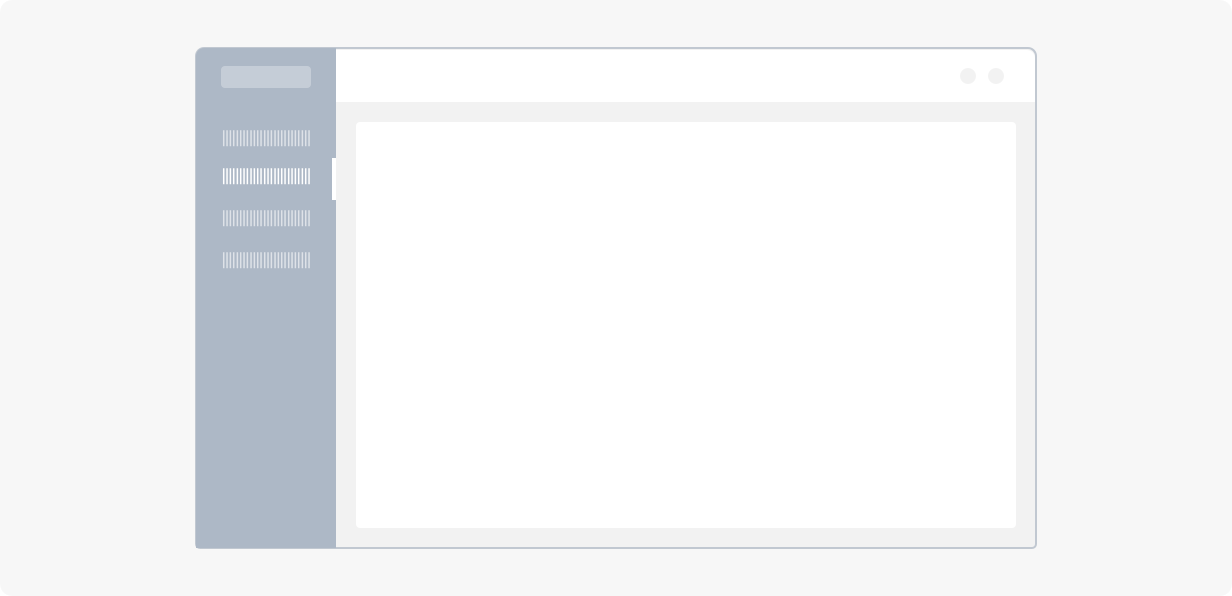
Vertical navigation is more flexible than horizontal one, menu items are easily extensible downward, and longer labels can be allowed. With help from a scrollbar, unlimited number of menu items can be supported. It is suitable for multi-level, operation intensive and dashboard-like web apps.
More layouts with navigation: Layout。
Breadcrumb#
Breadcrumb tell users where they are now among page hierarchy, and parent-child relationships between pages.
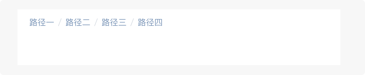
Notes: 1. When hierarchy is deep, it is recommended to hide certain pages. Depth of pages shown should at best be lower than 3, and should not exceed 5. 2. Avoid using breadcrumb as much as you can, especially when page contains other navigation components sufficiently telling where users are.
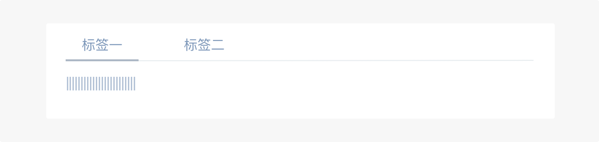
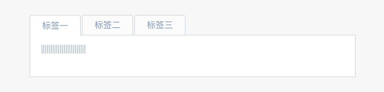
Tabs#
Tabs categorize content, in order to present large amount of information in a limited space. User can easily switch among tab panels without transitioning from one page to another. Categories can be determined via business logics or states, label for each category should contain less than 15 characters.
Basic#
Control content of the entire page. Usually used for switching among core functionalities.
Card#
Control part of page content. Bordered container naturally separate it from other parts of the page.
Pill#

Switch among options in a card. Usually used along with other types of tabs, so that user can navigate to intended content via quick tab switching.
Vertical#
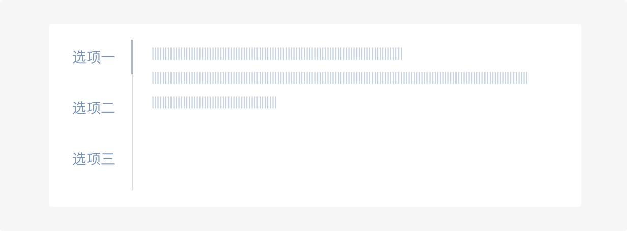
Used for large number of tab options. It can be easily extended to contain an unlimited number of categories.
Steps#
Steps is a navigation bar guiding users to perform a task following a predefined workflow. It gives users a rough estimate about how long the task is going take, tells them which step they are in, and showcases users' progress in an explicit way. It is always a good idea to break complex and procedural task into steps.
Horizontal#
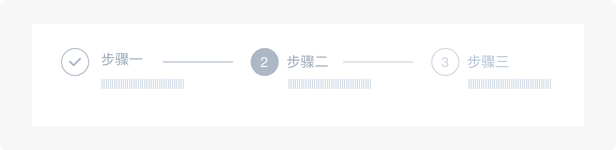
Used for more than 2 but less than 5 steps. Title for each step should contain less than 12 characters.
Vertical#
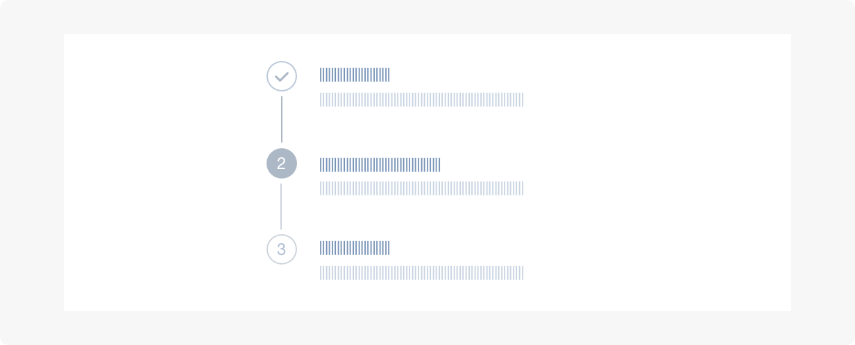
Usually float at the left side of pages, in a fixed position. Multi-line description can be attached to each step. Suitable for large or dynamic number of steps, i.e. time-based steps with dynamic descriptions.
Pagination#
Used for paginating large amount of content. Users can clearly know the total amount of content, how much they have already browsed and how much remains to be browsed.
Basic#
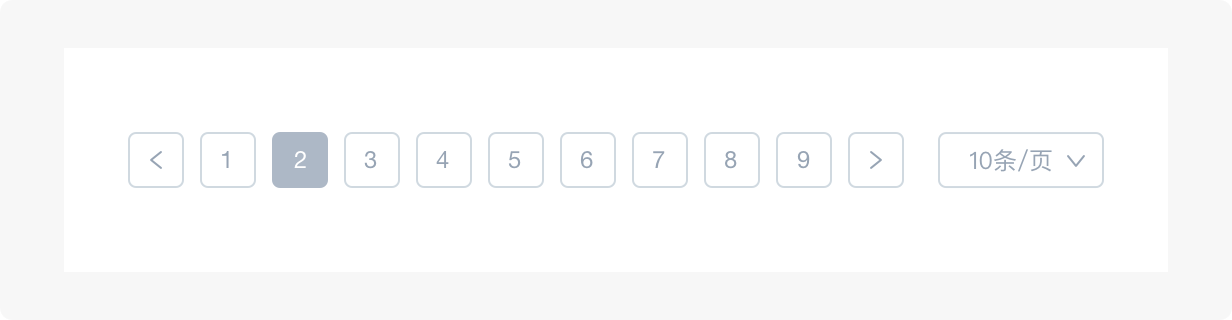
When there is a large number of rows, page size can be made customizable by users, so that users can query and browse information more flexibly and effectively.
Mini#

Commonly used in a Card or a floating layer.
Simple#

Commonly used in a Card or a data table, for no more than 10 pages.