Colors
Not only is color an effective way to create brand recognition, but it also plays an important role in conveying information, providing interactive feedback, and bringing attention to a particular element. Ant Design makes using color simple and practical through an emphasis on efficiency, clarity, and user experience. Please note the following three points when choosing colors:
Color usage and positioning should respect cognitive psychology (stay user-focused)
Visual hierarchy should be clear-cut, and color should establish visual continuity
Color usage should be in compliance with the WCAG 2.0 standards by using sufficient contrast to ensure accessibility
Color Palettes#
Ant Design's color palettes consist of 10 shallow-to-deep color swatches, and default palettes are defined for certain hues. Users can select a swatch from the color scheme using keywords. In theory, all colors used in the design should be taken from a color palette.
After careful tuning by designers and programmers, our palette generation algorithm uses a combination of color plus Bezier curves and different rotation angles for cold and warm colors to generate new palettes (replacing our original tint / shade color system). This algorithm can be used to generate new palettes based on an input color that you specify.
Ant Design's default theme consists of eight basic colors, each of which is derived from the above algorithm.
Note: In these shallow-to-deep palettes, the 6th color cell generally satisfies WCAG 2.0's 4.5:1 minimum contrast ratio (AA level), and is used as the default for the palette.
In order to provide contrast against different background shades, we chose White #FFFFFF and Black #000000 with varying transparency to distinguish foreground text. For details, please see font color.
Palette Generation Tool#
If the above palettes do not meet your needs, you can choose a main color below, and Ant Design's color generation algorithm will generate a palette for you.
Color application#
Brand color application#
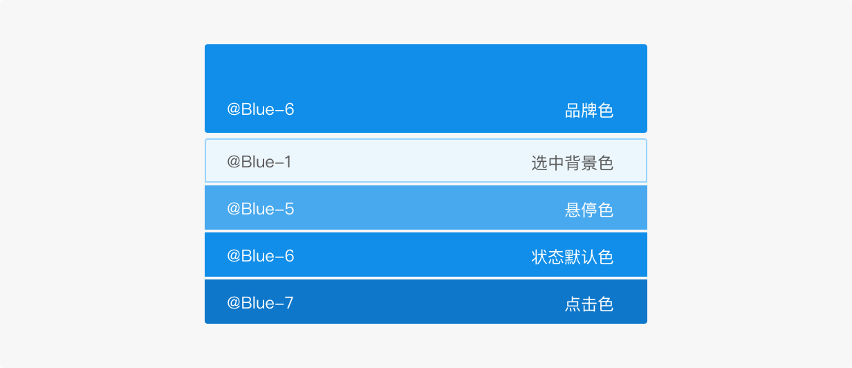
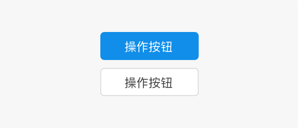
The brand color is one of the most intuitive visual elements used that is used to embody product characteristics and communicate ideas. When selecting colors, it is important to understand how the brand color is used in the user interface. Taking the default styles of an Ant Design web component as an example, the brand color is mainly reflected in key actions and when highlighting important information.
Note: Images and logos can not automatically adhere to the color palette, but should be compatible.
Neutral color application#
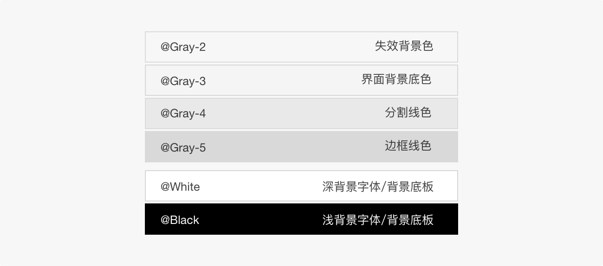
Gray as a neutral color is used extensively in Ant Design's web design, and its use facilitates the targeting and functional guidance of key content. This color is mainly seen in the navigation frame, backgrounds, secondary operations, and so on.
Functional color application#
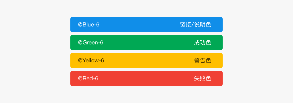
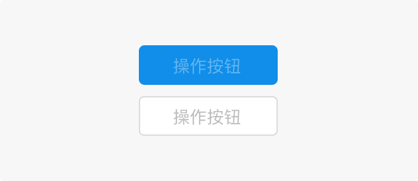
Functional colors are colors that are used to convey state. These are mainly used in notifications, form validations, status messages, etc. Green indicates success, yellow indicates alerts / warnings, red indicates errors, gray indicates skipped / disabled.
Visual hierarchy#
Use the brand color to convey important information or to highlight important actions while surrounding it with large areas of neutral color. This allows users to focus more on the task itself, improving efficiency.
Note: We suggest using no more than three colors in the user interface (except for within data charts and graphic illustrations)
Color contrast#
Ant Design's color palette conforms to the WCAG 2.0 standard. The foreground and background colors should always meet the minimum standard of a 3:1 contrast ratio.