List
List is a very common UI element which can be applied to various scenarios:
Get an overview
Browse item by item
Find specific list item
Sort and filter
Rearrange, add, delete or recategorize list items
Interaction#
Display Details#
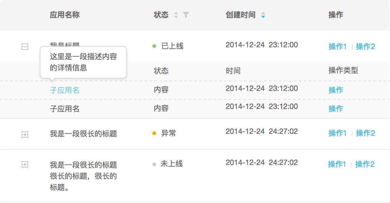
Popover: When a user click or hover a link or a piece of content, display a small amount of detailed information for corresponding list item in a floating layer.

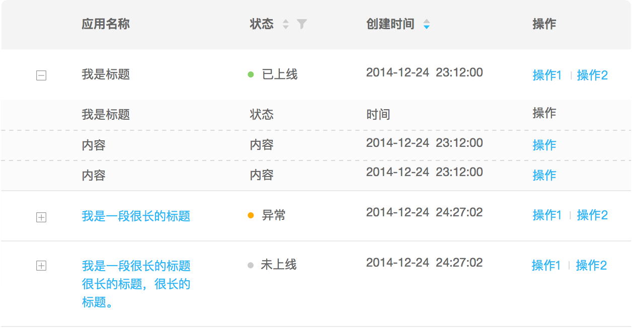
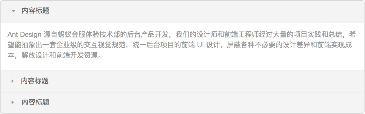
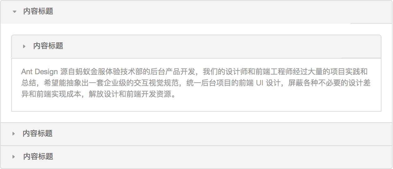
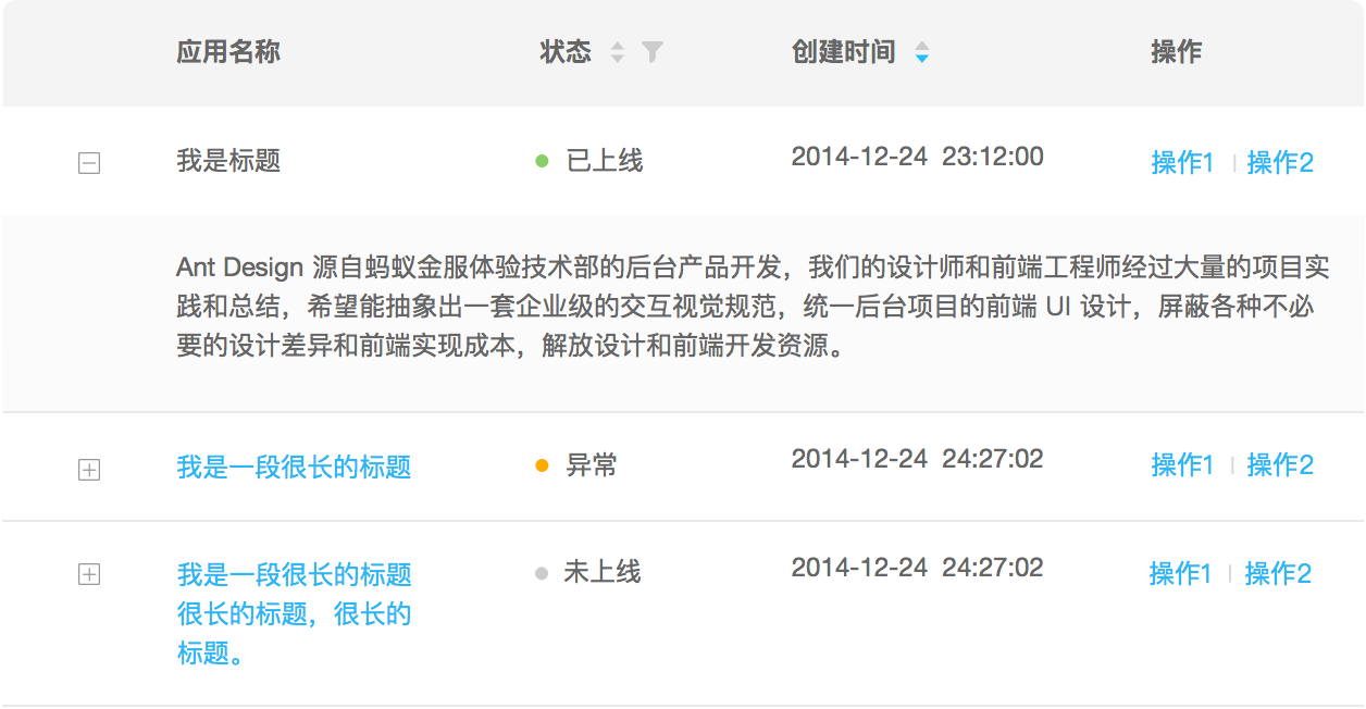
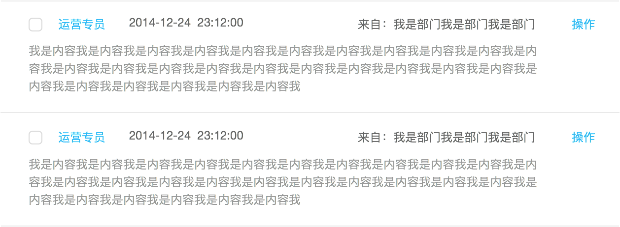
Embedding: A user can directly view detailed information in the context via a click, without openning a new page or modal.
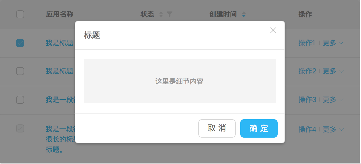
Modal: A user can view detailed information in a modal dialog via a click. But it loses the contextual/visual tie to the clicked list item, because, unlike popover and embedding, modal is usually presented in a fixed position regardless of the position of clicked list item.
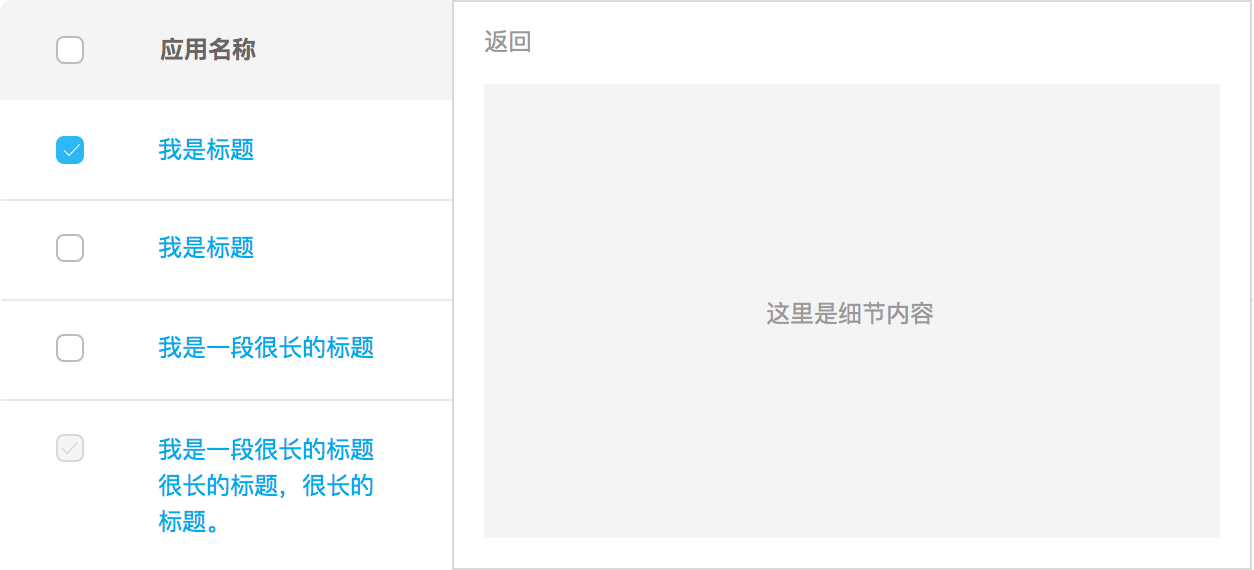
Dual-Panel Selector: A user can view a large amount of detailed information in a (usually right) panel beside the list.
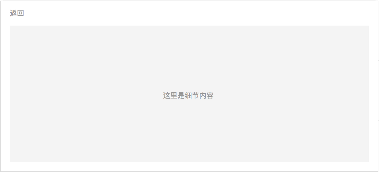
Full-Window: A user can view a large amount of detailed information in current page. This mode loses contextual/visual tie to the clicked list item, however it is suitable for scenarios where detailed information is completely irrelevant, or screen size is small (i.e. mobile), or list and details are huge.
Display More Text#
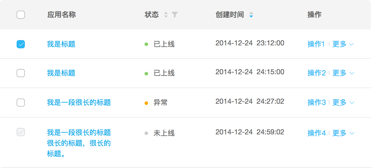
Text Wrap: Expand certain list item into multiline text.
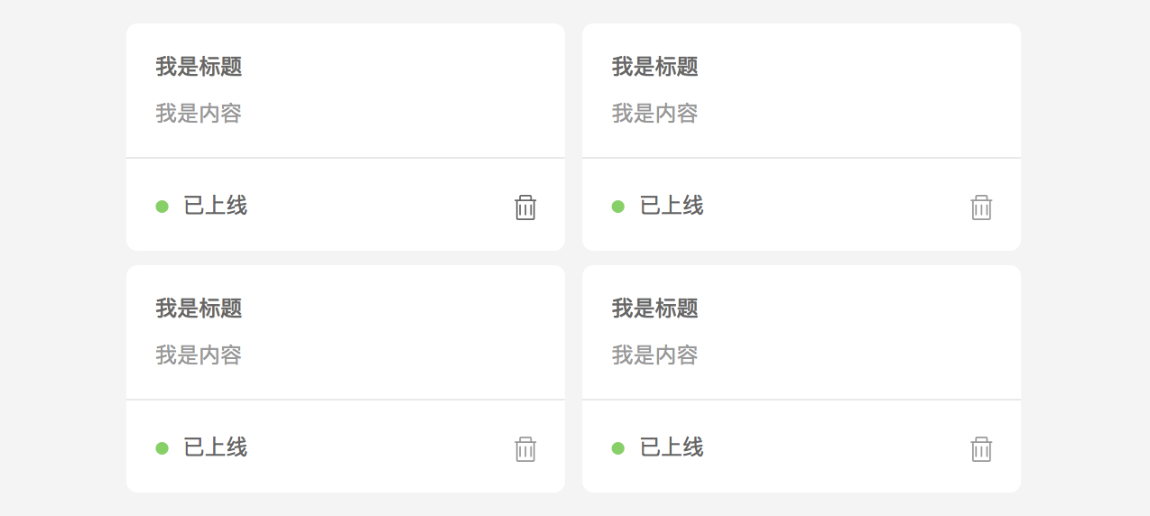
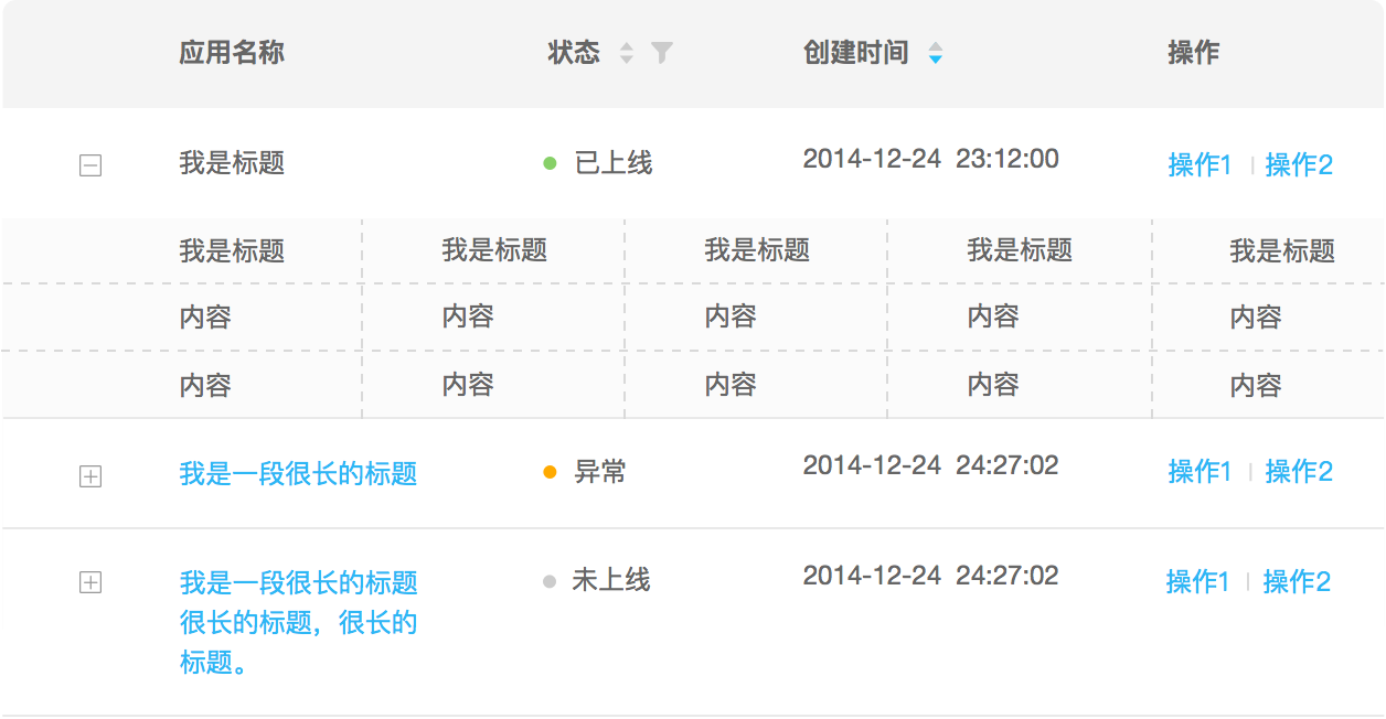
Grid: Arrange list items in a grid or matrix where each item shares a similar visual weight.
Display Images#
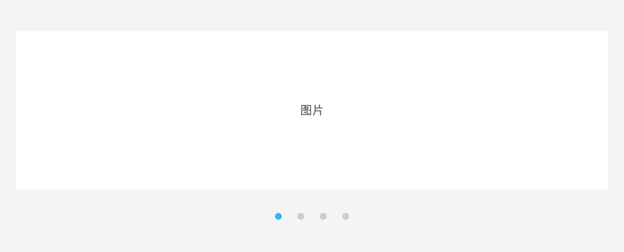
Carousel: Display images in one dimension, scrolling of images can be triggered either manually by user or automatically by system.
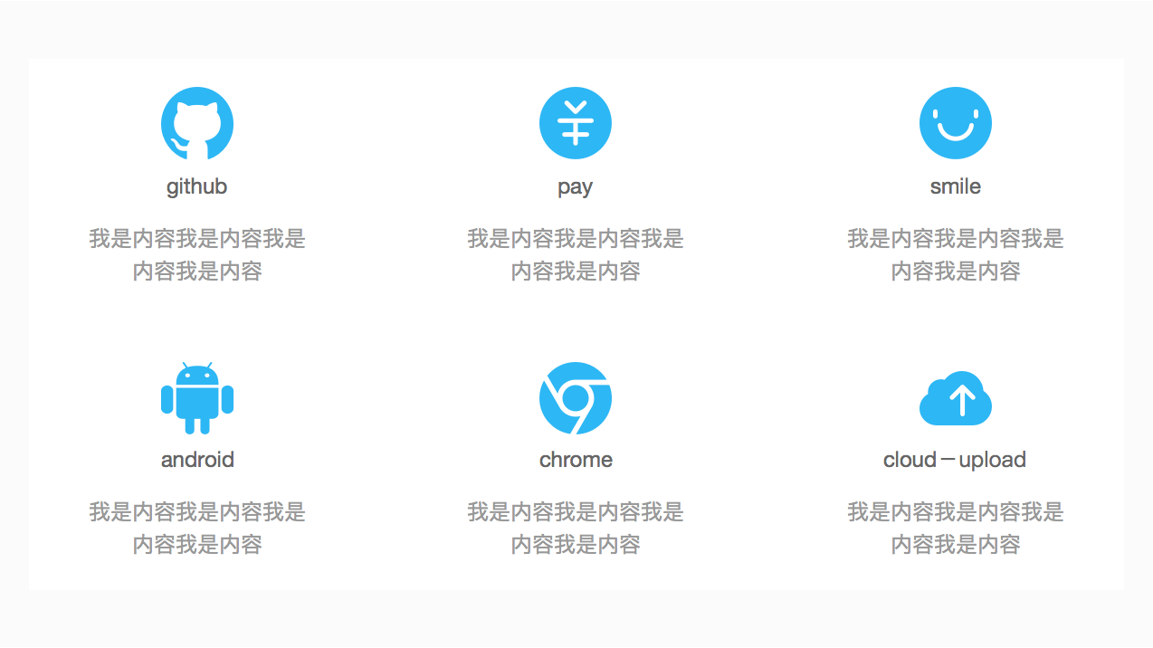
Thumbnail Grid: Display images/icons in two dimensions, this approach has strong visual effects which attracts user attention.
Display Long List#
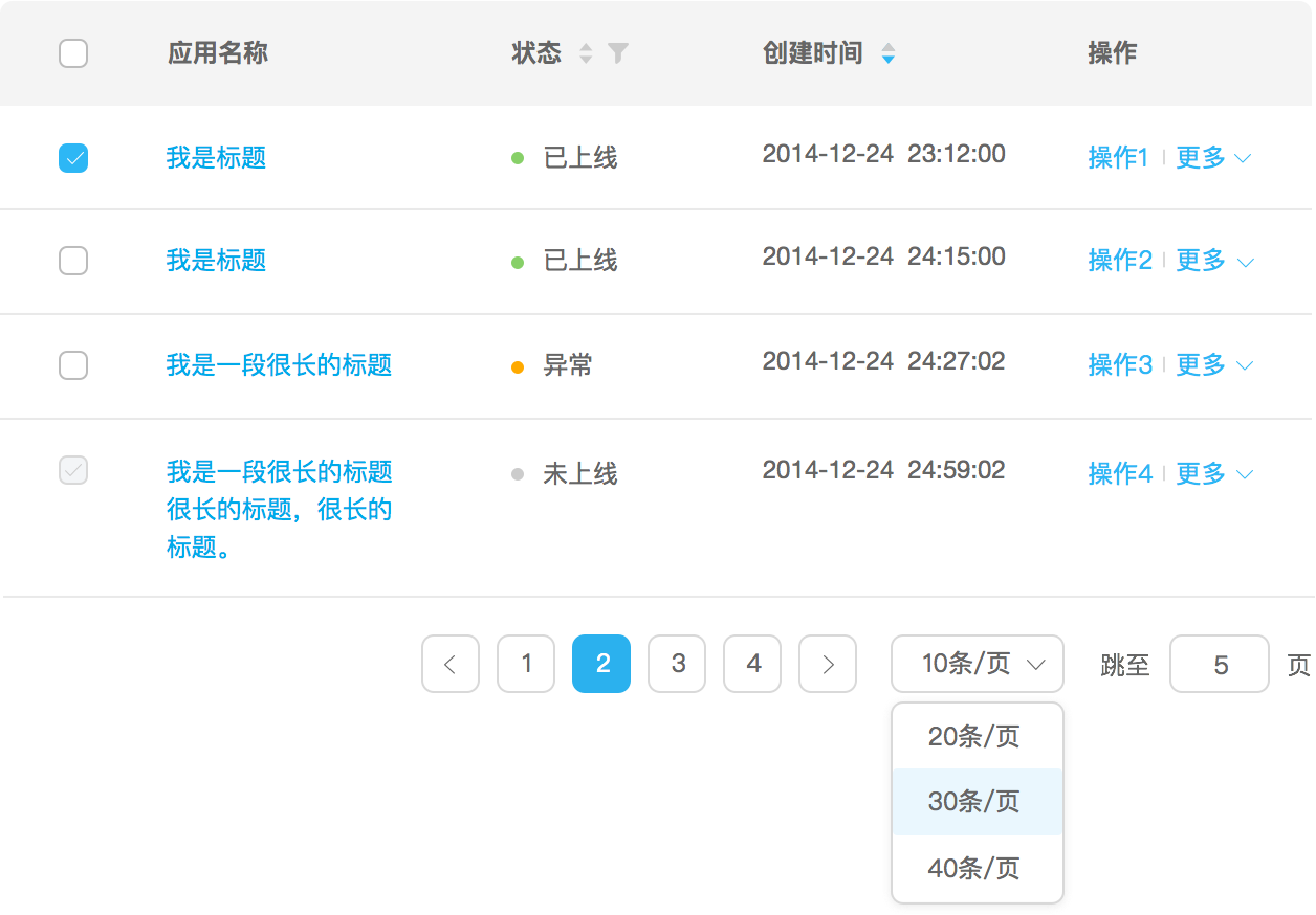
Pagination: Load list in a sectioned way, user determines whether to load other list items.
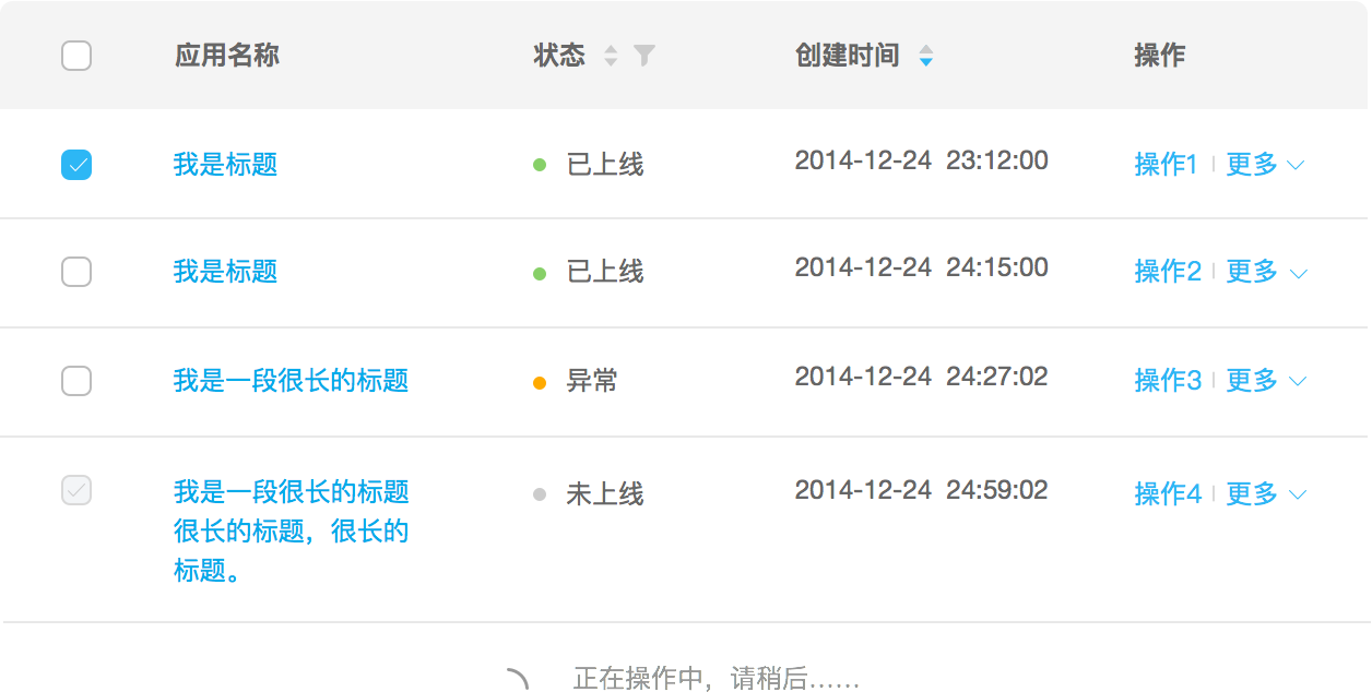
Infinite Scrolling: When user reach the bottom of the first section, load next section via listening to scroll event or a button click.
Display Categorized/Layered List#